February 18, 2013

Align width of container div to the sum of floating div

Question by Seb37

I have the following html:

<div class="main_container">
    <div class="sub_container">
        <div class="floating">wookie1</div>
        ...
        <div class="floating">wookie5</div>
    </div>
</div>

I want sub_container to have the exact width of the sum of the floating div.

If I use “display:table;” for sub_container and “display: inline-block;” for floating divs, it works fine:

enter image description here

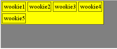
until I have enough div in the list, so that the sum of width is larger than main_container and they break on the next line:

enter image description here

But still, I want subcontainer (yellow background) to to be ALWAYS the EXACT WIDTH of the sum of the divs, even when they go on several lines, like this:

enter image description here

I’ve googled for hours now, and wasn’t able to find an elegant solution (css only, if possible.)

Here’s the jsfiddle, to play with this.

Answer by Starx

I got bored trying this and created a JS script based on jQuery to solve it.

var t = $(".sub_container").width()/$(".floating").outerWidth();
$(".sub_container").width(parseInt(t) * $(".floating").outerWidth());

Demo

January 17, 2013

Forcing <table> Columns to a Fixed Width; Prevent Automatic Expand

Question by Chad Decker

I generally set fixed column widths via CSS with flawless results:

#tableID thead tr th:nth-child(1){width: 75px;} 
#tableID thead tr th:nth-child(2){width: 75px;}
/* etc… */

But now I’m in a situation where I won’t know the desired column widths until runtime. Here’s an excerpt from the code I’m using to dynamically set the column widths:

var tr=$("<tr>");
var colArr=Home.ColDefs[this.statBatchType].colArr;
for(var i=0;i<colArr.length;i++){
    var col=colArr[i];
    tr.append(
        $("<th>")
            .html(col.title)
            .css("width",col.width)
    );
}
this.jqTHead.append(tr);

Sorry this code is a bit out of context but the bottom line is that I’m adding columns, represented by <th> elements, to a table header and setting each one’s width.

What ACTUALLY happens, however, is that Firefox is treating the column width as a minimum and then automatically expanding the column width as the user expands his browser window. Consider a case where my JavaScript code sets the width of each column to 75px. Firefox will ensure each column is at least 75px wide, but if the user maximizes (or enlarges) his browser, provided there is sufficient room, each column will be automatically widened.

This is odd to me since the JavaScript code would seem to be the functional equivalent of what I was doing in CSS. Yet the CSS approach doesn’t cause this odd behavior.

Any thoughts?

Answer by Starx

You can assign a class selector with the required css and then assign it later when you need it on runtime.

.fixed {
   width: 50px;
}

And assign them when you want in run time.

$("th").addClass('fixed');
March 31, 2012

Why doesn't the jQuery script set the width of an element?

Question by JamesCharless

James here. I’m working on a site that I want to have the same number of posts no matter what the screen resolution. I’m trying to use this script, but it’s not working. It SHOULD get the width of the page document, subtract 400px, divide that number by 4, and then set the CSS of the element .entry to that math equation. Can anyone help me figure out what’s wrong? I’m new to jQuery, so it’s surprising I was able to even get this far.

EDIT: I solved my problem using this code in the end:

$(function() {
            var cwidth = $(document).width() - 100;
            var pwidth = cwidth - 150;
            var ewidth = (pwidth - 150)/5;
            $("#container").css("width", cwidth);
                $("#posts").css("width", pwidth);
                $(".entry").css("width", ewidth);
                $(".photo").css("width", ewidth);
});

So thank you all quite a bit for helping. However, I’ve ran into a few more problems. For some reason even though the script divides by 5, there are only 4 posts per row and the posts overflow out of the div they’re in. Example: http://jamescharless.tumblr.com/ – I think this is because the div the entries are in doesn’t have a width set in the CSS since it’s added with jQuery. Does anyone know how to fix this? Also, I tried implementing masonry by David Desandro, and it just messes up the whole page. I think this is also because the div #posts and the div .entry doesn’t get a width via CSS. Can anyone help me with either of these issues?

Answer by Jack Franklin

You need to do:

$(document).width()

Not

$("document").width()

Working JSFiddle: http://jsfiddle.net/WsZry/

$(function() {
    width = ($(document).width()-400)/4;
    $(".entry").css("width", width);
})​;

As document isn’t a HTML element, it’s a JavaScript property.

Answer by Starx

You quoted the document inside double quotes $("document")

$(function() {
    var width = ($(document).width() - 400)/4;
    $(".entry").css("width", width);
});
March 12, 2012

Is there a way to change the width of the <code> HTML tag?

Question by Yeseanul

I’ve noticed that any modification of the <code>‘s style with respect to its width doesn’t have any effect. It’s seems to always be set to “auto”.

I’m just trying to have some code written inside a <code> tag (this tag is mandatory due to some known iBooks bugs) that has 100% width. One workaround is to put the <code> inside a <div> which has a 100% background style. This works OK but I’ll have to deal with a couple of hundred <code> tags… This is the reason I would prefer just to be able to modify the <code>‘s width.

Any thoughts?
Thanks.

Answer by Rob W

<code> elements are inline elements. Setting a height or width on these do not have any effect on their size.

Use display:inline-block::

code {
    display: inline-block; 
    width: 100px; /* Whatever. The <code>'s width will change */
}

Answer by Starx

Add a display: block or inline-block as per you requirement to the code element. Rest should work as planned

See an example

March 9, 2012

Allow images in a <div> to be wider than lines of text in the same <div>

Question by Horace Loeb

I want to fit text in a <div> to the width of the <div>, but fit images in the same <div> to the width of the parent <div>

This diagram should make things clear:

(here’s the URL if it’s too small: http://dl.dropbox.com/u/2792776/screenshots/2012-01-22_1838.png)

Answer by Starx

With a little bit of js, you can do this with avoiding all the complication.

$(document).ready(function() {
    //read every images
    $("img").each(function(k,v) {
        //get the width parent's parent
        var width = $(this).parent().parent().innerWidth();
        //use it
        $(this).css('width',width);
    });
});

Demo

June 14, 2011

100% DIV width is not really 100%

Question by Kevin

When I have a <div> with width: 100%, it is not really 100%:

<div id="div">testtesttesttesttest</div>

...

#div {
  width: 100%;
  background-color: red;
}

Now when you resize the window, so there is a horizontal scrollbar, and you scroll to the right, then the background is vanished. How can I remain the background in this case?

Here you can see the problem in action:
http://beta.ovoweb.net/?i=3

Now when you resize the window and scroll to the right, you can’t see the background anymore. How to fix this?

Answer by jsumners

The 100% value is 100% of the parent’s width or the view port. See the documentation.

Answer by Starx

Width: 100%, is highly affected by its margin and margin and padding of its parent (body in your case). SO, reset them first

Something like

body {
    margin: 0;
    padding: 0;
}
#div {
  margin: 0;
  width: 100%;
  background-color: red;
}

DEMO

March 31, 2011

resizing div width with browser resize

Question by leora

i recently asked this question on how to have a container div width set so i could avoid scrolling for folks with wide monitors. I got a great answer basically to combine min-width with display: block;

I now have one follow up. The accepted answer works great if the browser up front is set to be wide but if at first its not wide and a user stretchs the window, the div container doesn’t change or stretch.

is there anyway i can take this one step further and reset the width of the div when the browser window itself resizes.

Answer by clairesuzy

you could use absolute positioning,

#panel {
 position: absolute;
 top: 50px;
 left: 50px;
 right: 50px;
 bottom: 50px;
 background: #eee;
 border: 3px double #000;
 overflow: auto;
 }


<div id="panel"><p>I shrink and grow</p></div>

overflow:auto; sets a scroll bar on the #panel itself if the content requires it.. which may not be desired?

Working Example

Answer by Starx

How about estimating the area of screen, your page should cover and writing the width in percentage?

For example,

#wrapper { width: 90%; }
...

Please fill the form - I will response as fast as I can!