May 25, 2013

div how to make its dimensions exactly as those of the contents

Stark’s Question:

How do I form a div to have the same dimensions as those of the content housed by it , and not any larger ?

The div that I currently has a larger width than that of the three divs that i have placed inside it.How can i get it to fit the inner div’s size?

Here is the link to what i have now :: http://jsfiddle.net/jairajdesai/Fd5hQ/
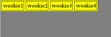
HTML :

<div id="initial_options">
            <div class="option_button" id="option_1">
                <big>1</big> <span class="supplementary_text">text goes here</span>
            </div>
            <div class="option_button" id="option_2">
                <big>2</2></big> <span class="supplementary_text">text goes here</span>
            </div>
            <div class="option_button" id="option_3">
                <big>3</big> <span class="supplementary_text">text goes here</span>
            </div>
</div>

CSS :

#initial_options {
position:relative;
top:18%;
left:0;
z-index:10;
background-color:#eee;
}
.option_button{
width:20%;
border-radius:none;
}
#option_1{
background-color:#013adf;
}
#option_2{
background-color:#f7fe2e;
}
#option_3{
background-color:#ff0000;
}

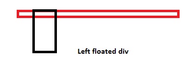
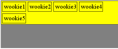
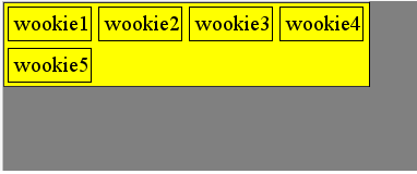
Inline element like <span> wraps around the content and more. Either you can use this or you can set the display property as inline.

div {
   display: inline;
}

However setting to display as inline will not give you any option to add top/bottom margin and padding. If you want to add that too, you should use inline-block as the property.

div {
    display: inline-block;
}
May 15, 2013

How CSS float works? Why height of the container element doesn't increase if it contains floated elements

Boy Pasmo’s Question:

I would like to ask on how height and float works. I have this outside Div and an inner Div that has content in it. It’s height my vary depends on the content of the Inner Div but It seems that my inner div will overflow with it’s outside Div. What would be the proper way to do it? Any help would be much appreciated. Thanks!

<html>
<body>
<div style="margin:0 auto;width: 960px; min-height: 100px; background-color:orange">
    <div style="width:500px; height:200px; background-color:black; float:right">
    </div>
</div>
</body>
</html>

The floated elements do not add to the height in the container element, and hence if you don’t clear them, container height won’t increase…

I’ll show you a pictorial way

enter image description here

enter image description here

enter image description here

More Explanation:

<div>
  <div style="float: left;"></div>
  <div style="width: 15px;"></div> <!-- This will shift 
                                        beside the top div, why? because the top div 
                                        is floated to left, and hence making the 
                                        rest of the space blank -->

  <div style="clear: both;"></div> 
  <!-- Now in order to prevent the next div to float besides the top ones 
       we use `clear: both;`, this is like a wall, so now none of the div's 
       will be floated after here and also the container will now count the 
       height of these floated divs -->
  <div></div>
</div>

My other answer here will explain you why we clear, though I’ve explained it here too

You can also add overflow: hidden; on container elements, but I would suggest you to use clear: both; instead.

Also if you might like to self clear an element you can use

.self_clear:after {
  content: "";
  clear: both;
  display: table;
}

Its because of the float of the div. Add overflow: hidden on the outside element.

<div style="overflow:hidden; margin:0 auto;width: 960px; min-height: 100px; background-color:orange;">
    <div style="width:500px; height:200px; background-color:black; float:right">
    </div>
</div>

Demo

March 18, 2013

Inline div causing uneven layout

Question by Tiffany

I’m working with Twitter and have pulled a list of all my followers and their screen names down using the API. I’m trying to display them in a nice ‘grid’ on my web page. However, it currently looks like this:

Bad layout

The issue happens when the person’s screen name is so long that it goes on to two lines. I don’t know why it sometimes puts a single person on a line like that…

Here’s my CSS code:

div.inline { 
float:left; 
padding-left: 40px;
padding-bottom: 20px;
text-align: center;
font-family: sans-serif;
width: 90px;
}

And the HTML code:

<div class = "inline">
    <?php echo $userName; ?><br>
    <?php echo "<img src = ".$userImage." class = ".$class.">"; ?><br>
    <select name = "choice">
        <option value = "blank"></option>
        <option value = "cool">Cool</option>
        <option value = "uncool">Uncool</option>
    </select>
</div>

Can anyone help? Perhaps there is a way to put in a blank line after the first line of their name or something if it’s less than two lines long?

Answer by fanfavorite

The reason someone is on a single line is because each div is different heights. Either wrap the username in an element (div for example) and set a height to that or set a height to the entire inline div. I think it would be nice to have the images aligned though, so the first option is best.

<div class="inline">
    <div class="username"><?=$userName;?></div>
    <?='<img src="'.$userImage.'" class="'.$class.'" alt="'.$userName.'" />';?><br />
    <select name="choice">
        <option value="blank"></option>
        <option value="cool">Cool</option>
        <option value="uncool">Uncool</option>
    </select>
</div>

For 2 lines use the following:

.username { 
   height: 30px;
   line-height: 15px;
}

Increase height by line-height value for each line you want.

Answer by Starx

Specify a fixed height for the name and image. Your problem will be solved.

Update your markup as this:

<div class = "inline">
    <div class="name"><?php echo $userName; ?></div>
    <div class="image"><?php echo "<img src = ".$userImage." class = ".$class.">"; ?></div>
    <select name = "choice">
        <option value = "blank"></option>
        <option value = "cool">Cool</option>
        <option value = "uncool">Uncool</option>
    </select>
</div>

And CSS to something similar.

.name { height: 30px; }
.image { height: 200px; }
March 7, 2013

Tables vs Div vs Spans

Question by samyb8

I have always heard that it is better to avoid using <table> in HTML.

However, I encountered a situation in which a table would make my life easier when building a page that shows multiple products and their characteristics.

Should I try to hack it so that I do not need a table, or should I just go with a table?

Answer by Starx

No, you should not avoid the TABLE concept. Learn/Use it to display tabular data, not web layouts.

Learn about those elements from the W3C.

  1. Tables
  2. Div
  3. Span
March 1, 2013

Robust page layout when re-sizing

Question by Sam

I currently have two divs on my page that are about center-left, and they’re both floated left. My problem is that when I resize the page to make it smaller, the right div will sink under the left div, and I would prefer it to maintain it’s position next the the other div.

What CSS sorcery would allow me to do this? (if any)

Answer by hmb

Hi Please check the following corresponding codes, it ll helps you….

<html>
    <head>
        <style type="text/css">
            #left {
                border:1px solid red;
                width:40%;
                height:auto;
                float:left;
            }
            #right {
                border:1px solid blue;
                width:40%;
                height:auto;
                float:left;
            }
        </style>
    </head>
    <body>
        <div id="left">
            <h1>Sample 1</h1>
            <h1>Sample 1</h1>
            <h1>Sample 1</h1>
            <h1>Sample 1</h1>
        </div>
        <div id="right">
            <h1>Sample 2</h1>
            <h1>Sample 2</h1>
            <h1>Sample 2</h1>
            <h1>Sample 2</h1>
        </div>
    </body>
</html>

Answer by Starx

While developing a fluid layout, a common mistake is mixing, % units with px values.

Size of % is respective to available space and does not work efficiently when there are values with px or em or ...

If you are using % units to size the layouts, you have to make sure, you have to % for everything border, padding, margin.

For such layout

<div id="left">
    Left
</div>
<div id="center">
    Center
</div>

CSS,

#left, #center { float: left; }
#left { width: 26%; padding: 2%; }
#center { width: 66%; padding: 2%; }
February 18, 2013

Align width of container div to the sum of floating div

Question by Seb37

I have the following html:

<div class="main_container">
    <div class="sub_container">
        <div class="floating">wookie1</div>
        ...
        <div class="floating">wookie5</div>
    </div>
</div>

I want sub_container to have the exact width of the sum of the floating div.

If I use “display:table;” for sub_container and “display: inline-block;” for floating divs, it works fine:

enter image description here

until I have enough div in the list, so that the sum of width is larger than main_container and they break on the next line:

enter image description here

But still, I want subcontainer (yellow background) to to be ALWAYS the EXACT WIDTH of the sum of the divs, even when they go on several lines, like this:

enter image description here

I’ve googled for hours now, and wasn’t able to find an elegant solution (css only, if possible.)

Here’s the jsfiddle, to play with this.

Answer by Starx

I got bored trying this and created a JS script based on jQuery to solve it.

var t = $(".sub_container").width()/$(".floating").outerWidth();
$(".sub_container").width(parseInt(t) * $(".floating").outerWidth());

Demo

September 18, 2012

How do I align a <div> to the center of a <div>?

Question by Gregory Little

I’m using HTML/CSS to make a website and on my home page I have some <div> tags that are inside <div> tags. I can’t seem to get the inner <div> tags to align to the center of the outer <div> tags. Here is the HTML code i am using (the one with the stars next to it is the one that I want to align);

    <div id="container">
<div align="center" id="box" style="background-color:black;width:375px;height:400px;border:0px solid #003300;">
<h1 id="heading"></h1>
<h2 id="otherheading"></h2>
**<div align="center" id="box" style="background-color:white;width:275px;height:225px;border:0px solid #003300;">**
<ul class="list-tick">
    <li></li>
    <hr>
    <li></li>
    <hr>
    <li></li>
    <hr>
    <li></li>
    <hr>
    <li></li>
</ul>
</div>

And this is my CSS:

#container {
  margin: auto;
  width: 1125px;
}

#container div {
  float: left;
  height: 400px;
  width: 375px;
}

Any help will be greatly appreciated. If you have further questions about the problem, I will try and explain in more detail.

Answer by Starx

Remove the floats, and add these

#container div {
  margin: 0 auto; /* Center Horizontally */
  height: 400px;
  width: 375px;
}
August 12, 2012

How to keep two inline-block divs side by side even if second div overflows

Question by Gilles jr Bisson

I have the following html and css code :

<!DOCTYPE html>
<html>
<head>
<style type="text/css">
body
{
  background-color:#d0e4fe;
}

div.container
{
  width: 600px;
  border: solid 1px black;
}

div.divLeft
{
  display:inline-block;
  border: solid 1px red;
  color: red;
}

div.divRight
{
  display:inline-block;
  border: solid 1px blue;
  color: blue;
}

</style>
</head>

<body>
  <div class="container">
    <div class="divLeft">
      <p>1 - Some short text</p>
    </div>
    <div class="divRight">
      <p>Some not too long text with the div besides the first one.</p>
    </div>
  </div>
  <div class="container">
    <div class="divLeft">
      <p>2 - Some short text</p>
    </div>
    <div class="divRight">
      <p>Some very long text that will eventually wrap because it is so long and when it wraps is when the trouble starts because the div moves down instead of staying besides the first one.</p>
    </div>
  </div>
</body>
</html>

In the second case, is there a way to keep the div besides the first one instead of it moving below the first one. Note that I can not use fixed width for my divs as the length of the text that will appear in them in unknown. Then only thing I know is the text in the first div will always be short and the text in the second one may be long.

Here is a basic diagram of what I would want :

First div text  Second div text stays beside the first one
                and wraps around still being aligned like this

Thanks all !

Answer by Gilles jr Bisson

Ok. I finally manage to do exactly what I needed with the use of a table with only one row and two cells. The table takes the whole width. The text of the first cell is nowrap so it takes up all the space it needs. The text on the second cell takes up the remainder of the space and wraps as it needs and stays nicely aligned.

Answer by Starx

Elements displayed as inline-block wraps according to its contents and tries to remain inline. The code you are using does exactly this. When the second div’s content is overflowing it increases the size to accommodate.

The proper solution to this, is to add width to the element.

.divLeft { width: 150px; vertical-align: top; }
.divRight { width: 400px; vertical-align: top; }

Demo

June 26, 2012

How to restrict the div to margin right or left

Question by Rana Muhammad Usman

I have created a custom scroll. In which I am shifting the contents right and left by increasing or decreasing the margin. I want to restrict the div not to margin more when the last or first content is visible or you can say I want to make it like scroll. How I can restrict the div not to move anymore

$('#left').live('click' , function(){
$('#myDiv').css("margin-left","-=10px");

})
$('#right').live('click' , function(){
$('#myDiv').css("margin-left","+=10px");

})

JS Fiddle

Answer by Starx

Define and maximum limit for margin left or right, then use this value to compare before changing its position.

var maxMargin = 500, minMargin = 20;

$('#left').on('click' , function(){
    if($('#myDiv').css("marginLeft") > minMargin) {
        $('#myDiv').css("margin-left","-=10px");
    }
});

$('#right').on('click' , function(){
    if($('#myDiv').css("marginLeft") < maxMargin) {
        $('#myDiv').css("margin-left","+=10px");
    }
});

And use .on() rathan than .live(), as it has been deprecated.

May 15, 2012

jQuery function enable a div

Question by user1213807

I’m this code embed my js file for win key close. This codes:

jQuery(document).keydown(function(e){
    alert(e.keyCode); // replace "37" below with the windows key code
    if (e.keyCode == 37) { 
       alert( "windows key pressed" );
       return false;
    }
});

Working good. But i want only work 1 div. How can i do this?

Answer by mprabhat

Add the selector instead of document

jQuery('selector') instead of jQuery(document)

where selector can be anything like id, class e.t.c

Demo which uses selector as id

Another Demo will work for only one input inside a div.

Div Demo will work only for first div

Disabled for Div will work only for span not for div

Disabled for input in div will work for all input if they are not inside a div

Answer by Starx

Use your div selector instead of document selector.

jQuery("#yourdivid").keydown(function(e){
    alert(e.keyCode); // replace "37" below with the windows key code
    if (e.keyCode == 37) { 
       alert( "windows key pressed inside div" );
       return false;
    }
});

To disable a div, you can simple use $("#yourdivid").prop('disabled', true);

...

Please fill the form - I will response as fast as I can!